BLOGGER TEMPLATES AND TWITTER BACKGROUNDS

Wednesday 27 April 2011

Evaluation

In what ways does your media product use, develop or challenge forms and conventions of real media products?

We both used and challenged conventions of thriller films in our opening. One way was the use of a female antagonist, protagonist AND victim. Thrillers conventionally have a female victim because females are seen as weaker and less powerful than males, but seeing females playing the role of the antagonist and protagonist is less common, for the same reason. However, this isn’t actually seen in the opening of our film – the only character that we get to clearly see is the female victim, so the opening itself doesn’t challenge this convention. This isn’t, in our opinion, a disadvantage, as it’s important that the opening establishes a genre for the audience. If the opening had too few conventions of a thriller genre, it would be impossible for the audience to tell that that was the genre!

As well as this convention, we used low-key lighting, which is found in almost all thriller films, due to the fact that it creates suspense because you can’t see as clearly, and makes it seem eerier because of connotations with darkness that audiences subconsciously make. The only limitation we had with this was being unable to film during darker periods of the day, which meant we had to rely on editing software to create false low-key lighting, which wasn’t as natural or as dark as we originally aimed for.

Fortunately, we had more choice over our location, and as such we chose an area which gradually changed from being open to more closed in, creating a more claustrophobic feeling and the idea of being trapped throughout the opening. This was also helped by our use of camera shots and angle – we used unconventional shots (which are actually conventional for thriller films), and a lot of handheld camera shots to create the idea of being stalked.

We also used a lot of non-diegetic sound in the form of a typical thriller music soundtrack. The music is suspenseful throughout, but changes towards the end to create a more tense atmosphere. We did keep partly to our original aim to use diegetic sound by completely cutting off non-diegetic music at the end and using the only heavy breathing, panicky, and high-pitched scream, all of which create a lot of tension by themselves.

The other important convention we kept to for our film opening was the use of graphics. As mentioned previously, we took inspiration for our graphics from the film Se7en, where the words are in a creepy font and jump around the screen. This helps to put our audience on edge and therefore confirm the genre of thriller.

How does your media product represent particular social groups?

As our film opening only clearly shows one character, there is limited representation of any social groups. However, as mentioned previously, it shows that females are generally viewed as being more helpless and less dominant than males, particularly as this specific female is murdered.

On the contrary, our film as a whole represents females as being as powerful and capable of just as much as males, by the use of females as the protagonist and antagonist. This is atypical of both thriller films and society in general, where females are more likely to be the victims rather than the heroes.

What kind of media institution might distribute your media product and why?

We expect that our film would be an independent UK production rather than a Hollywood blockbuster. This thought was backed up by the views of our test screening audience. We felt this would be an appropriate institution for our product, due to its low budget, small scale location, unknown cast and lack of special effects. The budget itself is the reason as to the other elements that make this an independent production – we can’t afford to travel far or hire out studios or well-known locations, little known actors and actresses don’t demand such outrageous paycheques and special effects are highly expensive. However, well-known independent films such as Slumdog Millionaire prove that they can still be just as successful!

Who would be the audience for your media product? How did you attract/address your audience?

Our primary audience for our media product is 15-24 year old females, with a secondary audience of 15-24 year old males. Because we use females as our antagonist, protagonist and victim, other females feel like they can relate more to these characters, and males feel attracted to these females, as well as being attracted by the thriller genre. We felt that this age range would be appropriate as the film would probably be rated a 15, our actresses would be around this age, further allowing them to identify with the characters, and we intended to use mobile phones, which is a type of technology popular with young people. We identified this early on in the planning, which would allow us to direct our advertising at this audience, by creating pages and apps on social networking sites such as Facebook and Myspace, using tv advertising during programs that are popular with young people (e.g. Skins, The X Factor, The Only Way Is Essex), and designing a poster that’s trendy and modern but still portrays the thriller genre.

What have you learnt about technologies from the process of constructing this product?

During the filming of our film, we learnt to become more competent when using a video camera, but personally, I felt my editing skills improved the most. We needed to change the lighting of our shots using the editing software, and we discovered how to do this by trying out new areas of our software that we’d never used before. I also found out how to not just make a shot darker, but change the colour tint of the light, which was useful in softening the differences in natural light between shots that were taken on different days. I would also say that my continuity editing definitely improved, as I’ve become more accurate with cutting the shots to the exact point I need them. Unwanted diegetic sound was also no longer a problem, as, along with my group, we figured out how to remove it, and put in the non-diegetic sound we wanted instead. In addition, we discovered how to actually take snippets of diegetic sound (in our case, the text tone), and move it to all the desired places.

Looking back at your preliminary task, what do you feel you have learnt in the progression from the prelim to the full product?

As mentioned in the previous question, I’ve learnt a lot about editing skills in this progression, much of this being due to trial-and-error, and the need to either improve on current skills (e.g. continuity editing) or develop new ones (e.g. change the light of a shot). However, my prelim task helped me to start developing my basic editing skills, which have allowed me to become a better film editor for our main task.

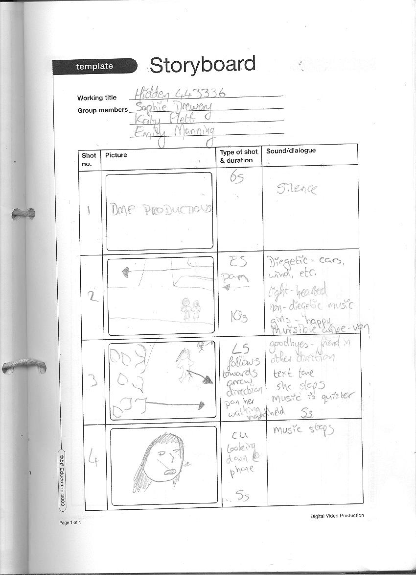
Outside of editing, I realised from my prelim task about the importance of having a good quality storyboard and sticking to it as much as possible. I will admit, my storyboard for my prelim was awful, as I didn’t really think it would be important, and whilst at first we stuck to it, we went off track and just started shooting whatever we thought would work. However, this resulted in poor continuity editing and a lack of shot variety. This time, I spent more time on my storyboard (although my drawing skills are fairly basic, you can at least see the most important details), and we actually stuck to it. Consequently, we ended up with a large range of good quality shots, plenty enough to ensure that our continuity editing wouldn’t suffer for it.

We also learnt of the importance of a shooting schedule – not all shots need to be filmed one after the other! It’s much easier to film all shots that are in one particular area at the same time.

What would you improve and why?

There are only a few aspects of our opening that I feel need improving and that if we were to do a task like this again in the future, we would make sure we did.

Firstly, some of our shots were quite unsteady. Whilst some were intended to be like this, in order to give the impression of being watched, other only ended up like this because we didn’t rely on the tripod as much as we should’ve done. This is something we were all guilty of, but I know we’ll all take more care over this in the future.

Whilst we were able to edit in the darker lighting, it wasn’t as dark as we originally wished, because that made the details less clear, and even though I edited the differences out as much as possible, the fact that some shots were filmed on two different days is still visible. If we were to shoot again, we would actually film in darker light in order to rely less on editing, and try our best to film everything on the same day, or if this wasn’t possible, choose two days with as similar a level of sunlight as possible. This would further improve the continuity of our film opening.

Saturday 9 April 2011

Final Cut


This is the final cut of the opening for our film, Hidden!

Audience Feedback

In order to make sure our film opening appeals to our target audience, we conducted a test screening. We used a female majority, and most of the viewers were 16 or 17 years old, which fits in with our target audience, so we knew that their answers would be relevant. However, we did also use someone in their 50s, which we thought would help us to see if they also thought our film would appeal to our target audience, and if we'd possibly eliminated other important target audiences. Their answers, however, confirmed our thoughts that we'd correctly identified our target audience.

We asked them if they thought any improvements needed to be made. 6 people said, yes, 6 said no. The improvements were:
  • to finish the scream at the end - we have now completed this
  • to completely finish editing and improve continuity - this has also been done
  • change the ringtone - we chose not to do this, as only one person mentioned this, and others had in fact praised the ringtone we used
  • the beginning - unfortunately, this was all that they specified, so we weren't 100% sure what they meant and were therefore unable to improve it
  • 2x making the lighting at the end darker - we have tried our best to do this, but unfortunately, our editing software, in the end shot, was unable to compensate for not having filmed later in the day (this was the only shot that did this though)
Everyone else felt that no improvements needed to be made, so considering this and the improvements we were asked to make, it seems that we've successfully reached our target audience.

We asked them what genre they thought our film would be, and everyone answered either thriller, horror, or a sub-genre of these (e.g. psychological thriller), so we've correctly used thriller conventions to show our chosen genre of film.

All participants also correctly identified our target audience as being teenagers ages 15+, although only two extended this to the full 24 years of age, and one person thought it would appeal to those up to 40 as well. However, this could be due to the fact that we used mainly teenagers for our test screening, so they would be unsure what people in their twenties would want to watch. In hindsight, we should've used some people in their early twenties too.

The majority of answers said that our film appeared to be an independent film rather than a blockbuster (2 said unsure, and 2 were unreadable), so it seems that we've correctly brought this across to our audience.

Also, everyone thought the name of our film (Hidden) worked well with the genre and what happened in the opening, and thought the graphics we used helped to make it more effective and more true to it's thriller genre. We can therefore see that we don't need to make any changes to this aspect of our opening.

Everybody also felt that the sound we used was appropriate and created the right atmosphere for a thriller film. They liked both the diegetic sounds (panicky, breathlessness, screaming) and non-diegetic music, which shows that this will be effective for our audience. The only problem was a little bit of editing that needed completing (as mentioned earlier), which has now been sorted.

All feedback on the use of camera shots was positive, and often stated that they fitted in well with the genre. Two particular shots that were praised were the one half-hidden behind a bush, and the end shot where Amalia runs down the path and the person holding the camera (myself) chases down after her. The only criticism was that one person thought there should've been more cross-cutting, but we don't see how we could've done this without changing the plot of our opening, which ourselves and our audience liked.

The majority also said that they would watch our film (only a couple said they wouldn't, but that was only because they don't like scary films), which proves that our film opening is effective in grabbing the attention of the correct target audience. We appear to have been accurate in making our film appeal to the audience we wanted, and we are now confident that our film would be successful in the real world.

Friday 8 April 2011

Example Of My Editing Skills 3

This is an example of my editing skills with diegetic and non-diegetic sound. The line of pictures at the top is the actual images displaying on screen, the blocks below that are diegetic sound, and the blocks at the bottom are non-diegetic sound. Specifically, I sorted out a problem with the non-diegetic sound, this being that we wanted to use two different music soundtracks, which had a different tempo and timbre to them. I found an appropriate place in both pieces of music to cut them so that the change, whilst obvious that there was a change in music, sounded more natural than had done previously, and didn't have a gap between them, which would ruin the tension we were trying to create. I also timed the second piece of music to Amalia's facial expression changing, though this can't be seen from this shot.

Example Of My Editing Skills 2

This is an example of my skill in graphics and editing. We wanted to use the graphics from the opening of the film Se7en to inspire our own graphics, in particular, the jumping movement of the words, and the idea of numbers in the actual film title. To do this, we created several individual slides, and placed the word "Hidden" on each one, but in a different place on the screen. We then, for all but the first and last slide, replaced some of the letters with the corresponding numbers that you would use if you were texting the word "Hidden" (443336). I came up with this exact idea because I thought it worked well with the theme of texting in the opening of our film.
In addition to the ideas we took from the film Se7en, we decided to add individual effect to each word that gave a creepy effect. The one I chose for the example gives a good idea of the types of effects we chose. This part was a group effort - we looked through several different effects, and decided, as a group, which ones would work best. However, it was my idea to use a transition between shots to make it appear even more fidgety. The transition we chose was one where the screen folds in on itself several times before reappearing with the new slide, and we felt this was much more effective than simply having one slide after another.

Example Of My Editing Skills

This is an example of my personal editing skills. As mentioned in the previous post, our shots were all taken in daylight, but we want our film to be much darker. As you can see, we edited the shots so that they appear to be a much later time of day than they were actually shot. However, this shot in particular is an example of how editing can be used to help even out differences between shots. This shot was performed on a different day to most of the others, and as such, the level of light was different to the other shots. This specific day was much sunnier than the day that we did most of the shots, but unfortunately, simply adding more of the darker effects to this shot didn't even out the differences between shots, it simply made the details harder to see. In spite of this, I aimed to find a way to sort out this problem, and found that by using a colour tint to this shot, it made it appear more like the others. Now, it's much harder to tell that they were shot on different days.


Friday 1 April 2011

Shot 2

Unlike the first shot I posted on here, this shot was originally in the storyboard, although, when actually at the location, I noticed that there was a large bush on the side of the path which Amalia runs down for this shot, I thought a good idea may be to move the camera so that it has the impression of someone jumping out from behind a bush in which they'd been hidden. The other members of my group agreed, as this shot was supposed to be a point of view shot from someone running after her, and this added to this effect. However, also unlike the first shot I posted, this shot took several takes, as I discovered that running after someone with a camera in your hand and keeping the camera steady enough to still see what's going on at the same time is very difficult. In the end, I decided to use small zooms to get closer to Amalia without having to run at the same speed as her, which allowed me to keep the camera steadier than previously. Although the shot is still pretty shaky, this was the effect we wanted, and you can still see Amalia clearly. We told her to run from the beginning of this path rather than just from where the shot begins, so that she's already in full flow when she passes the camera and it looks more natural. Obviously, when editing, we will cut the beginning and end of the shot, and, like the first shot, make it darker to seem like we filmed later than we actually did.

Shot 1

This is one of the shots that I filmed myself, of which I am most impressed with. It took only one attempt to film, although it wasn't in our original storyboard. This is because we underestimated the length of the path we use for our location when designing our storyboard, and we didn't allow enough shots to cover the whole path (although we thought we had when we planned it.) However, I'm quite glad we came up with it because it works very well. Amalia (our actress) was told to run from just before where she'd ended in the previous shot, and I zoomed the camera on her to a long-shot (I stood quite far away from her, as you'll see in the clip). As she ran, I zoomed out to show the full length of the path, and Amalia ran just out of shot and then across the front of the camera, the effect of which I really liked, as it was almost like an invisible wipe. I'm very proud of the fact that I managed to create such an interesting shot to solve a last minute problem, and of how it turned out on the first cut. Even though it's daytime and quite sunny, getting a darker effect for our thriller genre won't be a problem, as before going out to film, we played around with our editing software with a couple of practice shots to see how dark we could make the background without making details unnoticeable. We're confident that we'll be able to make this shot, and our others, look darker using the editing software.

Tuesday 15 March 2011

Storyboard


Here are 4 images of parts of our storyboard:


The first shot isn't an actual shot, it's just an edited in title of our production company name.


In the second shot, we were inspired by an invisible wipe using a van that we saw in the popular tv series Skins, which is in the genre of social realism. Although it's a tv series rather than film, we thought the idea would be effective for our opening and would help us to create an element of social realism.


To go completely the other way and affirm our main genre of thriller, in shot three, we will have half the shot hidden behind a bush (we've already checked out our setting, and have found an appropriate bush to use). This wasn't inspired by anything else, I thought of this idea myself, but thought the fact that half the shot was hidden and it appears that someone is watching the girl from the bushes would create an action code and suspense.

We wanted to use extreme close ups like in the opening for the film Se7en, because we felt it allowed the audience to see certain details but not others, which makes them question the details they can see and want to know the details they can't. We thought we should use this for when the girl in our opening receives and replies to text messages, because the audience will be just as confused by the messages as the girl will.


We're also using a shot that will hopefully be a little disorientating for the audience. We plan to start with a close up of the phone, and slowly zoom out and over the girl's shoulder. Although we haven't taken this shot from any particular opening, we liked the use of other disorientating shots created by special effects like in Fight Club where it is highly zoomed in on a characters skin and zooms out to reveal what the image actually is.


We liked the idea of using an arc at a mid shot because it allows the audience to see more of the surroundings (but not too much), and also makes them see how panicked the girl is by her body language. This was used in the film Reservoir Dogs, and personally, I thought it was effective for the reasons stated. Also, it's a fairly unusual camera movement to use, which is exactly the kind of thing we want in our thriller film.


Contrasting from the earlier mid shot, we wanted a close up of the girl's facial expressions so the audience could clearly see the panic on her face. This was used in the opening to the thriller film Taxi Driver, where it allowed you to see the expression on the driver's face more clearly, and is also something I've seen in other thriller films. If a character, particularly one who, at this point in a film, seems to be a victim, we tend to empathise with them more, and this facial expression will make the audience also feel panicky and worried for the girl.

Thursday 24 February 2011

Audience Feedback

My group presented our ideas so far for our opening to a group of people who we perceive would be in either our primary or secondary audience (females 15-24, males 15-24), and asked them to give feedback.
Many people, both male and female, liked the idea of going against typical thriller stereotypes by having having a female protagonist, antagonist, AND victim. Using similar graphics to Se7en was also a highly popular idea, as was the use of a handheld camera. However, although using diegetic sound was praised, it was suggested that we use non-diegetic sound together with diegetic sound to create a creepier effect. Our group has decided to follow this advice, so although diegetic sound will be an important part of our piece, non-diegetic sound will also play an important part.
Our audience seemed to understand the plot of our film and opening, so it must be comprehensible for them, although some were confused as to whether it would be a mainstream or independent release. I think this partly comes from the fact that our group hadn't really discussed this ourselves, but once we did, we decided it would be a mainstream release.
So far, our opening seems to appeal to our target audience, so, after making a couple of tweaks, we feel more confident about going ahead with creating our opening. We will try out a test screening when we've created our opening with more people from our target audience to check we're making the right choices, and change anything we feel needs changing once we've received their feedback.
Due to the positive attitude we received, it seems we've correctly judged our audience. This will help us to make our film seem as attractive as possible to them. We know that this age group tend to spend more time than other age groups at the cinema, so cinema posters and trailers are a good way to start. However, we need to make sure we pick out elements that will not make these biased towards one particular gender. For instance, in the posters for the film 4.3.2.1. , the females were made out to be sex objects, which made the film less attractive to females. We don't want to make the same mistake. We also know that this age group (females in particular) tend to be very active online, especially on social networking sites such as Facebook and Myspace. It would be sensible to create pages on these sites (and other similar sites) in order to promote our film. As for tv adverts, we should target these at certain shows that are popular with this age group. This includes reality tv shows (e.g. The Only Way Is Essex), talent shows (e.g. The X Factor), teen dramas (e.g. Skins), and some comedy programs that tend to attract the younger audience (e.g. Family Guy, Mock The Week). Considering the genre of our film, it may also be a good idea to advertise during similar themed tv shows (e.g. Dexter, Prison Break) in order to appeal to people who particularly like this genre of film.

Tuesday 15 February 2011

Screenshot Inspirations

Here are screenshots from films which have inspired elements of our film:

Representation


This film inspired us because it uses a female protagonist which breaks the stereotype of thriller films. We are going to have a female victim, protagonist and antagonist, which completely breaks the typical representation of females in thriller films.

Titles and Graphics


We liked this font because it has a creepy effect and sets the mood for a thriller film. We decided this type of font would fit in well with our film because we want it to jump around the screen and put the audience on edge. Our title also has numbers (443336) and we like the way the number has been incorporated into the title.

Camerawork


Extreme close ups allow the audience to see certain, important details, but leaves out other potentially important details, leaving a mystery around the scene. We plan to use these in our opening scene on the mobile phone, so you can clearly see the number 443336, but not much else.


Establishing shots will also be used to show the setting. This is important as we intend the victim in the opening sequence to move from and open space to a more closed in space, and we want to clearly show this change in scenery in order to build suspense.


Fish Tank uses a handheld camera in the opening scene, which gives it a "real" sense. We want to include an element of social realism in our film, so we intend to use a handheld camera to capture this.

Sound


We intend to use purely diegetic sound, like in Scream, as this 1. gives it a sense of realism, and 2. builds suspense as we can clearly hear the diegetic sounds. The scream we will use at the end of the opening sequence is the most important of these.

Mise en Scene


The mobile phone in our piece will create an enigma code via the number you can see on it. What does the number mean? Who is it who's texting the victim? These are the questions we want our audience to ask.


We will use plenty of low key lighting in our opening sequence, which is highly typical of all thrillers, as we tend to be more scared of the dark and we can't see things quite as clearly.


Continuing the element of social realism we want to include, we will use urban clothing for the costumes of our characters. This is typical costume for social realist films, especially for the age range of our cast and audience, teenagers and young adults.

Editing


We will use continuity editing in our opening, like in Fish Tank, to help the element of social realism we want, and to show the run up the the victim's death clearly.

Conventions Of A Thriller

For our coursework, our group has decided to make a thriller film. In order to do this, I've researched screenshots from famous thriller films to find the conventions of them.

Inception


The gun gives a sense of danger, as it could result in somebody being killed.

It looks as though a chair/stool has been thrown into the bath in the background, suggesting there’s been a lot of movement (most likely violence) prior to this screenshot.

The lighting is natural, and as it’s filmed inside, this makes it look quite dark for the daytime.

Psycho


The woman is naked, and this makes her appear more vulnerable.

Her screaming face also shows the audience that she’s feeling scared and vulnerable.

In the background, you can see the shadow of a raised hand, which gives the impression of somebody about to stab her, but it’s more of a mystery as you can’t see the real hand.

The Silence Of The Lambs


Contrary to the previous slide, this woman is shown using a high-angle shot, making her look more powerful (which is also unusual in thriller films).

Again, there is a gun involved, which immediately adds a sense of danger.

There is only low-key lighting, which makes it seem more dangerous as you’re less able to see everything that’s going on.

Se7en


The lighting in this screenshot is even more low-key, again making the situation seem more dangerous.

The man on the right has a red stain on his tee shirt, which suggests that someone has been injured badly.

There are three people watching the two men in the background, which gives the impression that they’re always being watched.

Fight Club


Who wrote the writing in the background, and why? This is an example of the enigma code.

The man is looking at something out of shot, but the audience can’t see what. This is an example of the action code.

The lighting is again low-key.

Jaws


The mast has fallen over, leaving the man hanging dangerously over the sea.

There’s a shark’s fin in the background, which also adds to the sense of danger, although it’s not as obvious as the mast.

Yet again, there is an example of guns being used.

Die Hard


The lighting is very low key once again, meaning the audience can’t see the details as clearly.

Again, there is a gun involved, adding the element of danger.

The man is holding the gun and the woman is at the other end of it, making her the victim, typical in thriller films.

Sin City


Although there is no gun in this screenshot, there is a knife, another type of weapon, so the danger is still there.

Yet again, the lighting is very low key.

However, the woman seems to have more power as she is bearing the weapon in this case.

Pulp Fiction


The blood stains on the man on the right’s shirt are a very obvious sign that violence has been going on.

The two men are blocked closely together, making them appear stronger.

They are also both wearing suits, making them appear authoritative, and therefore more powerful.

Saturday 12 February 2011

Conventions Of A Thriller

For our coursework, our group has decided to make a thriller film. In order to do this, I've researched screenshots from famous thriller films to find the conventions of them. This slideshow shows my findings: